

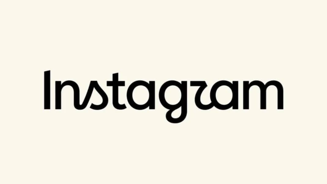

Instagram Wordmark Redesign 2026: Instagram has refreshed one of the most recognisable parts of its visual identity, introducing a redesigned Instagram wordmark after nearly a decade.
The change is relatively small, but it has already triggered a strong reaction online, with users debating whether the new design is actually an improvement.
The update was announced by Instagram head Adam Mosseri, who said the wordmark at the top of the app had remained unchanged for around 10 years and was ready for a refresh.
According to Instagram’s announcement, the new design aims to feel cleaner and more modern while retaining elements connected to the platform’s original identity.
Importantly, the change is mainly about the wordmark the way the word “Instagram” is written rather than a replacement of the familiar app icon.
What Has Changed in Instagram’s New Wordmark?
Instagram Wordmark Redesign 2026: The redesigned wordmark moves away from the cursive lettering that users have associated with Instagram for years.
The new treatment combines flowing, curved elements with more conventional letter shapes, creating a noticeably different appearance.
Some of the most visible changes can be seen in letters such as “s,” “g” and “r”. The result is a more compact and contemporary-looking wordmark, although its unusual combination of styles has also become the main reason behind the online criticism.
Instagram says the redesign takes inspiration from the platform’s original character while focusing on simplicity and craftsmanship.
The company has also been developing a broader visual identity around its typography, including updated versions of its type system and additional fonts.
Instagram’s Gradient Camera Icon Has Not Been Replaced
Instagram Wordmark Redesign 2026: One detail that is important to clarify is that Instagram has not introduced a completely new app icon with this update.
The familiar multicoloured camera symbol associated with Instagram’s current identity remains in place.
The colourful gradient icon was introduced in 2016, when Instagram moved away from its earlier, more detailed camera design. The 2026 update instead focuses on the brand name and wider visual system.
This distinction matters because “Instagram logo” and “Instagram wordmark” are often used interchangeably in online reports.
In this case, the most accurate description is that Instagram has refreshed its wordmark, while retaining the recognisable gradient camera icon.
Why Is the Internet Calling It “Instagzam”?
The redesign quickly became a subject of online jokes and criticism.
According to media reports, several users on X and other social platforms questioned the readability of the new lettering. Some users said the redesigned “r” makes the name look as though it says “Instagzam”, while other variations of the joke have also appeared online.
Some reactions have focused on the visual style itself. Critics have argued that the new wordmark sits somewhere between traditional cursive lettering and a modern sans-serif style, making it look less consistent than the previous version.
Other users simply feel that the older wordmark had more personality. Since the previous design had been part of Instagram’s identity for almost a decade, changing it was always likely to attract strong reactions.
At the same time, not every response has been negative. Some people have welcomed the cleaner and more contemporary direction, suggesting that the success of the redesign may become clearer once users become accustomed to it.
A Look Back at Instagram’s Logo Evolution
Instagram’s visual identity has changed considerably since the platform launched in 2010.
The original Instagram icon was a detailed camera illustration, reflecting the skeuomorphic design style that was common at the time.
It was created by co-founder Kevin Systrom and was soon followed by a more refined camera design associated with designer Cole Rise.
The latter became the familiar Instagram camera icon used through much of the platform’s early growth.
That identity lasted until 2016, when Instagram introduced one of its most significant visual changes.
The detailed camera was replaced by a much simpler symbol featuring a colourful gradient and a white camera outline.
The redesign represented Instagram’s shift toward a cleaner digital aesthetic and eventually became one of the most recognisable social-media icons.
The latest 2026 update is considerably more restrained. Rather than replacing the camera symbol again, Instagram has chosen to change the typography surrounding its name.
Why Instagram Changed the Wordmark Now
For a global platform, a wordmark needs to work across mobile applications, websites, advertising, creator content and other digital environments.
Instagram’s latest redesign appears to be part of a wider effort to make its visual identity more flexible while keeping recognisable elements from its past.
The company has described the refreshed wordmark as cleaner and more modern, while Instagram’s design team has also highlighted ideas around individuality, creativity and self-expression in its broader brand system.
Whether users ultimately accept the change is another question.
Brand redesigns often receive criticism when they first appear, particularly when a familiar visual identity is replaced.
Instagram itself experienced this in 2016 when the new gradient camera icon initially attracted considerable criticism before becoming widely recognised.
What Happens Next?
Instagram’s new wordmark is expected to become part of the platform’s refreshed visual identity during 2026. The change may look minor compared with the company’s dramatic 2016 logo redesign, but it marks an important update after nearly ten years of familiarity.
For now, the reaction remains divided. Instagram sees the new wordmark as a cleaner and more modern expression of its identity, while a section of the internet is still asking why the old design needed to be changed at all.
One thing is certain: after nearly a decade without a major wordmark change, Instagram has once again managed to turn a small design decision into a surprisingly big internet conversation.
Also Read: FSSAI Seizes 18000 Boxes of Diageo Liquor in Bengaluru Over Recycled Plastic Marking Violations